Tuesday, 30 September 2014

Photoshop Test Run


In today's lesson , we were taught about Photoshop for the first time. Since it was my first time, there were some difficulties, such as continuously having layers. This caused me to get confused about how to put text onto my magazine. However towards the end of the lesson, I started to get used to Photoshop and I am able to do it. It was a fun experience which will help me in my school magazine design!

Monday, 29 September 2014

College magazine analysis

Front cover analysis:
-The masthead is big but not bold. The lack of boldness can make the magazine seem more formal and professional. It can also make the masthead look mature. The colour of the masthead stands out from the white background, making it more eye-catching and appealing for the reader. 
-The 3 color scheme of the magazine is green, white and black. These three colors juxtapose from each other (e.g. black and white or green and black or green and white)
-Cover star:Zainab Salbi. Attire is white. The color white shows peace, happiness, innocence and purity.  The white clothing is the same as the white background, this allows us to see the cover star as her skin stands out from the white background, She is also wearing a ring that has a flower on it.
-Cover star position: One arm crossing over torso, holding onto arm whilst other arm is up. This gives her a feminine, innocent look.
-Cover star face: Displaying a full smile. This gives a natural feel to the cover star and makes her look happy and likable. This is similar to other college magazines where there tends to be someone smiling directly to the camera. By having someone smile at the camera, makes it look as if the person enjoyed/enjoys the college and is having a good time. This draws the reader, who may be in search of a good college. 
-Image: a studio photo shoot, gives a professional feel to the magazine. Medium short, from chest and above.
-There are no cover lines, no barcode and no pull quotes. This is different in comparison to  other college magazines as they will have pull quotes, cover lines and a barcode, making them more eye-catching and appealing, giving the reader an insight of what's inside. However even though this particular college magazine doesn't have any of these features, it gives a minimalistic and simplistic look. Also by not having a cover lines or a pull quote, makes the reader more curious to find out what's inside the magazine. It also stands out because it's not like the other college magazines. 
-On the top right corner, the season that the magazine was published in. The colors of the magazine suit the season, as the colors white and green are mostly used in Christmas.


Contents page analysis:
-1 image on content page
-1 image on first contents page. Bright image contrasts from white background.  the image does not have a  page number on it, in comparison to the other page numbers, making it difficult to find the article.
-Image shows the college, gives an insight into the college and the students. 
-All articles under the category of features. By there being only one category  makes it easier for the reader to find the article. 
-The sections in the contents page are in columns and are aligned, making the contents page organised allowing the articles in the magazine to be seen, making it easy to find the chosen article.
-The image does not have a frame, giving the page a modern feel, however by the font being a certain way, gives the contents page a sophisticated look.Additionally the titles of the articles are bold so the reader is able to identify between the articles. By the font being the same makes the contents page look organised and consistent.
-Information about the magazine, the school staff and the board of trustees is featured on the same page as the contents page.This covers the white background so the reader has more to read instead of just having a white background.
-The numbers next to the featured articles are small. This doesn't make the articles stand out, but gives a simplistic and minimalistic look to the contents page.
-Doesn't have the school's website at the bottom of the page. It also doesn't have the page number.However there is the school logo at the bottom of the page, branding the magazine and the college.
-The color scheme consists of black and white, This gives a simple and minimalistic look to the contents page.

Saturday, 27 September 2014

Maverick Magazine Analysis (Task 2 of AS Media Coursework)

Front Cover Analysis:
-The masthead is bold and black, with a red M. The black letters of the masthead contrast from the pastel cream background, making it eye-catching to the reader and standing out. As for the red M which stands for Maverick,it stands out on the front cover as it is the most bright colour on the cover, as it contrasts from the black font and the pastel cream background. This also attracts the reader. The font of the masthead is sophisticated but also simple. 
-House style.
- 3 colour scheme consisting of white, black and red, but mainly black and white, bringing colour to the cover, making it more eye-catching and appealing, as the colours stand out from the background.
-Cover star attire: Attire consists of pastel colours as well as black and white. The look is innocent and simple, giving a feminine and sweet look to the cover star. The pastel colours (pink and cream) are similar to the background, adding to the feminine and sweet look. The cover star is also wearing cowboy boots which give us the genre of music she makes, in this case, country music. She is also wearing shorts, which expose her legs which  can draw the male audience. 
-Cover star face: Cover star presents a natural smile without baring her teeth, making her look calm . A full face makeup can be seen from the bronzing on her cheekbones and her lip colour is a shade of pink. The pink is similar to her attire, giving her a feminine and young look.  We can also see heavy, dark eye makeup, which also gives her a mature look but still looking feminine.
-Cover star pose: Sitting on the ground with one of her legs stretched out. This makes her look laid-back. By having her elbow laid on her knee makes her look confident as well as relaxed.
-Full body shot. Photo shoot probably took place outside. Since it's outside, there would not be a need for lighting, only having to use natural lighting.
-Cover lines:  "Plus" cover line shows us the other artists featured the magazine but by Kacey's name being the biggest shows us that she is the featured main artist. By her name being bigger in comparison to the other cover lines makes it more eye-catching, so readers interested in Kacey will buy it, showing us that the featured article is about Kacey. Also by having the name of her new song below her name shows us that she is promoting her new song.
-Additionally the cover lines also show the other articles inside the article (e.g. Kalamazoo Girls, The Gibson Retrospective). The fonts of the cover lines are all in caps lock, making them stand out and appeal to the reader. The font is the same for all the cover lines except for the Kacey Musgraves cover line, making the cover line about the cover star stand out amongst the other cover lines and catch the audience's eye, making them want to read the article.
-By there being a cover line that says "Exclusive free DVD & CD Zac Brown Band" draws the reader, either because they are interested in the artist or products which are free are appealing. This will lead to more people buying the magazine, as it includes a free product.
-"Embracing the best of country, folk, bluegrass & roots music" cover line at the bottom of the front cover shows us the genre of music that the magazine is based on. This draws people who are interested in country, folk, bluegrass and roots music, so people would want to buy it.
- The cover line "New releases" may interest whose who are interested in the genre of music that the magazine is based on. By having the "new releases" cover lines draws the reader's attention as they may be interested in the new country music that is being released.
-Top right corner shows the price of the magazine and the bar code is placed on the bottom right corner.
Contents page(1) analysis:
-2 pages for contents page.
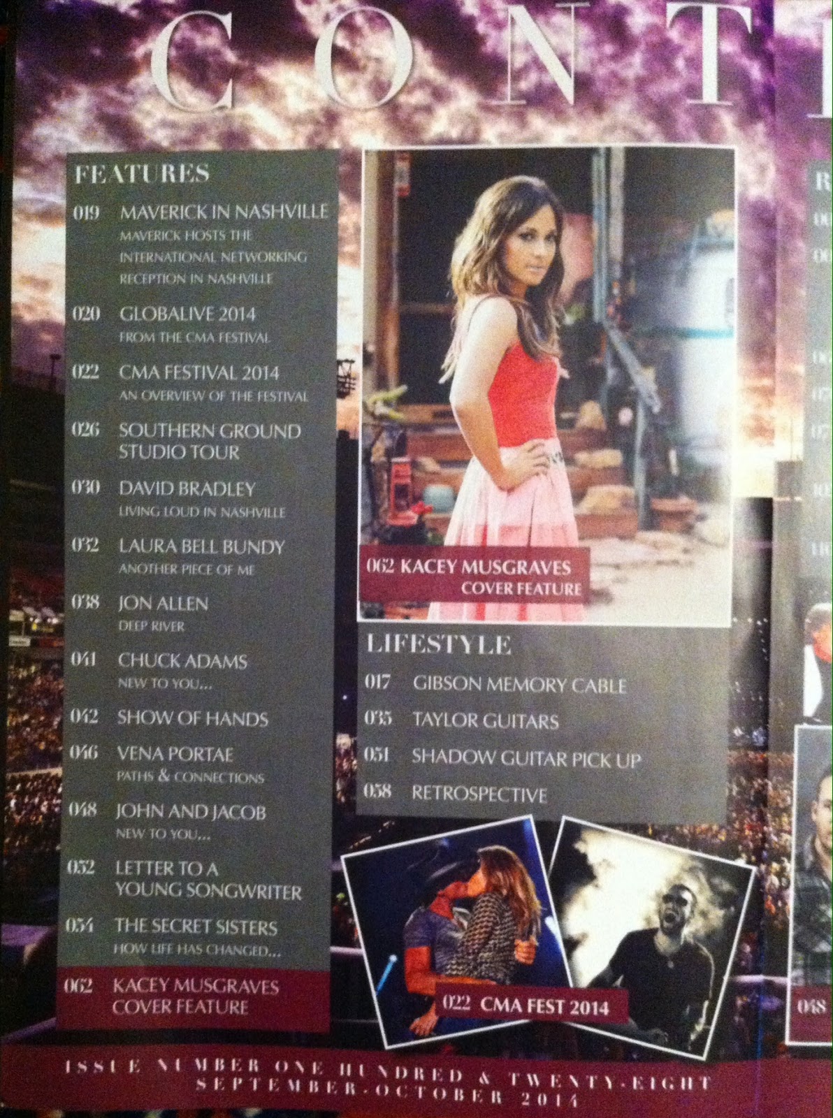
-The title for the contents page is bold, big and white. The white text contrasts from the vivid purple sky of the background. The font of the contents page title has a artistic look.The font of the titles for "features"  and "lifestyle" as well as the text boxes on the images, are similar to the contents page title, by which they have a artistic feel. As for the font under the "features" and  "lifestyle" categories as well as the text boxes on the images, they are the same throughout, however there is a change in font size. This is to show the title of the article and a brief description of the article.
-The 3 colour scheme for the contents page consists of oxblood red, grey and white.
-Editorial features: The sections in the contents page are in columns and are aligned, making the contents page organised allowing the articles in the magazine to be seen, making it easy to find the chosen article.
-Images are scattered around the page,showing the different articles featured in the magazine. By being scattered around allows the whole page to be covered instead of having a blank page, catching the readers attention. The images have a white border around them. This makes the images stand out more from the colourful background. It also makes the contents page look organised. 
-The first contents page has the categories "features" and "lifestyle", so readers are able to look under the categories they are interested in and are able to find a article which fits to their interest. The categories are placed in grey text boxes, whilst the text in the boxes are white. This makes the text stand out from the grey boxes.  However at the bottom of the "features" category, the cover star article is in a oxblood red text box. This makes it stand out amongst the "features" category, drawing the reader's attention so they will read it.  
-The images on the contents show Kacey Musgraves, the cover star and images from the CMA Festival in 2014. The image that shows the cover star, Kacey Musgraves is medium shot. Once again, the colour pink can be seen on her attire, giving her a feminine and youthful look.A full face makeup can be seen from the bronzing on her cheekbones and her lip colour is a shade of pink. The pink is similar to her attire, giving her a feminine and young look.  We can also see heavy, dark eye makeup, which also gives her a mature look but still looking feminine. From looking at the image, we can see natural lighting being used from the window behind Kacey, as light from her window is being hit to her back.
-  The images have oxblood red text boxes on them, as if highlighting the images, making them stand out,so the reader would want to read them. By having white text in the oxblood red text boxes, makes the white text contrast with the oxblood, making the text stand out more, making it more eye-catching. 
-The page numbers are displayed in a unique way . Instead of 19, the magazine presents the magazine as 019. This suggests that the magazine goes up to 100. It also differentiates itself from other magazines.
-At the bottom of the contents page, there is another oxblood text box which tells us the issue number of the magazine, showing us how long it has been running.


Contents page (2) analysis:
-The title for the contents is bold, big and white. The white text contrasts from the vivid purple sky of the background.The font of the contents page title has a artistic look.The font of the title for "regulars" is similar to the contents page title, by which it is giving a artistic feel. As for the font under the "regulars" category as well as the text boxes on the images, it is the same throughout, however there is a change in font size. This is to show the title of the article and a brief description of the article.
-The 3 colour scheme for the contents page consists of oxblood red, grey and white.
-Editorial features: The sections in the contents page are in columns and are aligned, making the contents page organised allowing the articles in the magazine to be seen, making it easy to find the chosen article.
-The first page has "features" and "lifestyle" whilst the second page has regulars, separating the important/ popular articles from the unimportant/unpopular articles Furthermore, the images are all in the same area however they are not aligned. This makes the page organised and separates the information on the page, allowing the reader to identify the articles and images from one another.
-The categories are placed in grey text boxes, whilst the text in the boxes are white. This makes the text stand out from the grey boxes and makes it look organised.The images have oxblood red text boxes on them, as if highlighting the images, making them stand out,so the reader would want to read them. By having white text in the oxblood red text boxes, makes the white text contrast with the oxblood, making the text stand out more, making it more eye-catching. The images have a white border around them. This makes the images stand out more from the colourful background. It also makes the contents page look organised. As for the three images on the page, the three artists that are presented on the second contents page are Laura Bell Bundy, The Secret Sisters and John & Jacob.
Firstly, by looking at the image of Laura Bell Bundy, the image is a up-close image of her face, clearly showing us the eye makeup she has used. From looking at the background, we can see that the image is not a studio photo shoot. As for the lighting, the use of natural light is evident by the light coming from behind and above.  Similarly with the image of The Secret Sisters, a up-close image with natural lighting. From looking at the image from The Secret Sisters, the use of heavy eye makeup can be seen, along with the dark red lipstick and dark clothing, giving a Gothic look to the duo. As for the image of the band John & Jacob, we can see that the image was from a studio photo shoot , with lighting used. The lighting is evident by which the shadows of the band members can be seen on the background of the image. None of the members are wearing makeup and their attire is similar to a stereotypical band, consisting of casual, grungy clothing.  All the artists promote their new songs by having the title of their new songs under the images, in the oxblood text boxes.
-The page numbers are displayed in a unique way . Instead of 5, the magazine presents the magazine as 005. This suggests that the magazine goes up to 100. It also differentiates itself from other magazines.

Double Page Spread Analysis:
-The colour scheme of the DPS (double page spread) is black and white.The black contrasts from the white so it allows the reader to read the article with ease.
- There are two columns in this page of the featured article however this structure is not consistent, as the other pages featuring Kacey have three columns or 4 columns. Fortunately, even though the number of columns is not the same throughout, the columns are aligned, making the page organised and simple to read.
-The font size remains the same throughout the columns.This makes the double page spread look organised and makes it easy to read.
-The images make the article interesting ,as some readers prefer images instead of a whole page dedicated to text. The images make the article more appealing as a result. 
-The white pull quote on the image  and in the middle of the second column highlight  quotes from Kacey and makes it similar to other magazines which include captions and quotes from artists. The quote also gives us an insight to Kacey, showing us that she appreciates the support with her fans and shows us that she wants her music to make people notice and see differently. The pull quote in the middle of the article, breaks the organised structure of the column. Even though it breaks the column, it makes the pull quote stand out amongst the columns of text. As for the pull quote on the image of the second page, it stands out from the bright and vivid background, so the reader will notice it and would draw the reader's attention to read the article. Furthermore, the font on the pull quotes are different from the font in the columns.. This makes the pull quotes more eye-catching, so the reader will notice them. The font of the pull quotes is in caps lock. By being in caps lock makes them more eye-catching,as text that is caps lock can suggest something important or urgent. This makes the pull quotes more eye-catching.The pull quotes are presented in white text boxes, making it organised
- The font of the drop cap is similar to a font that is mostly related to the Wild West and cowboys. As for the font on the first page, which shows us a full body shoot of Kacey Musgraves, similarly with the drop cap on the second page, it has the same font. This is  due to the genre of music Musgraves creates as country music relates with cowboys and the Wild West. 
-The images both show Musgraves posing.Once again, the colour pink can be seen on her attire, giving her a feminine and youthful look.A full face  makeup can be seen from the bronzing on her cheekbones and her lip colour is a shade of pink. The pink is similar to her attire, giving her a feminine and young look.  We can also see heavy, dark eye makeup, which also gives her a mature look but still looking feminine. From looking at the first  image, we can see natural lighting being used from the window behind Kacey, as light from her window is being hit to her back. Her face shows no emotion, with her lips slighting open. This makes her look relaxed. However, her body language speaks differently. By having her hands on her hips makes her look confident.  As for the second image, she has the same attire and makeup. In this image, the background presents greenery and nature.  The plants in the background look similar to cactus trees, which would be found in hot climates such as in Texas, which is were Musgraves is from. 
-At the bottom right of the page, the magazine title can be seen, branding the magazine. Additionally, the page number can be seen, allowing the reader to find the article.
-The article is about a country artist called Kacey Musgraves.  The journalism in the article is refreshing and unusual ,as it starts by giving some information about her tour in the UK and also gives us some information about the awards she had earned. Then the article becomes a sort of interview without the questions, just quotes or responses. Throughout the text, the tone of voice in the biography and interview is conversational, as the language used is not complex and informal (e.g. "This time I'm getting to play some of the venues that we played last time but some of them are bigger. So it's cool."). Despite her Texas origin, the text shows no sign of slang or incorrect language due to her accent. 


These CD's came along with the magazine for free. By having a free CD attached to the magazine appeals to customers as some may be interested in the genre of music that the magazine is involved in  or they are interested in the band ( Zac Brown Band and Maverick Music) and enjoy the music they make. This will make more people want to buy the magazine and will increase the sales. Additionally, by having the CD's on the magazine, it will help to promote the bands more, creating an increase in fans and make there music more popular, allowing them to make money.

Maverick is published by Hands Media. Hands Media also publishes: Security Buyer, Fire Buyer,  ITM, Showhome magazine, Newhome magazine and ME19 magazine. Maverick has it's own Twitter page, consisting of 1,786 followers  and 1758 followers on Facebook. 

Hands Media's description from Maverick official site:

"Hand Media is independently owned and operated. We currently publish seven titles, three consumer and four business-to-business, as well as producing publishing solutions for a diverse range of clients."

"Hand Media is different from other publishing companies as we have nearly two decades of publishing experience, producing a stable of successful titles that operate in a number of UK and International marketplaces. These encompass both consumer and B2B arenas. Our hardworking, flexible and creative working environment allows us to meet the needs of a diverse range of disciplines for ourselves and our clients."

Source :maverick-country.com

Audience & Institution:

Due to the Maverick media pack being from 2008/2009, I found it difficult to decide whether or not to  put the information from the media pack onto my blog, as the information may have been out-of-date and unreliable. Unfortunately, I was unable to find a media pack from 2014. Furthermore, the information in the Maverick media pack did not include much  information about the audience and it did not provide many  statistics and facts about the audience (e.g. the demographics of the audience, the genders of the audience).
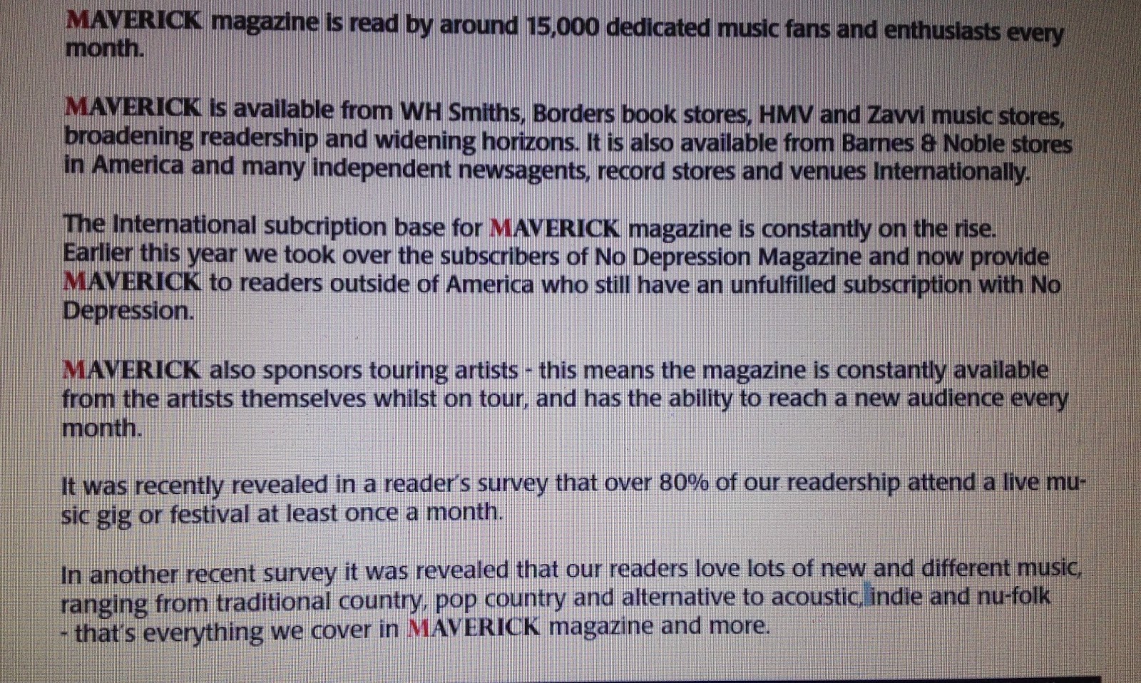


The only statistics I was able to draw from the media pack about the audience of Maverick is that the magazine is read by around 15,000 dedicated music fans and enthusiasts, being sold in stores such as WH Smiths, Borders book stores, HMV and Zavvi music stores, as a way of broadening readership and appeal to a larger audience in other countries. They appeal to a larger audience by also taking over the subscribers of No Depression Magazine and now provide Maverick to readers outside of America, such as the UK.  The media pack also tells us that over 80% of the readers attend a live music gig or festival at least once a month, supporting the first statement made on the list. This information was discovered by a survey. From another survey, the media pack tells us that the readers enjoy a variety of genres, ranging from traditional country, pop country and alternative to acoustic, indie and nu-folk. This information shows us that the magazine does not involve mainstream artists or music, showing us that it may only  appeal to a smaller audience in comparison to other magazines which are involved in RnB and pop music, since RnB and pop music are the most dominant in the music industry.


Thursday, 25 September 2014

MixMag Magazine Analysis (Task 2 of AS Media Coursework)

Front Cover Analysis:
-The Masthead is bold and bright, standing out from the blue background. The font also has a modern look and is composed of the words mix and mag (short for magazine), showing us that it is a music magazine. By the word magazine being shortened to mag makes it similar to slang and shows us the target audience as being young.
-House style
-3 colour scheme consisting of pink, white and blue, giving it a colourful look which is eye-catching and appealing. 
-Cover star Tiga: Attire is bright and is the same as pink font. Contrasts from background. Wearing a snap-back with the words "ACTION" on it, showing us that he is trying to promote his new album"Action Dancing".
-Cover star positioning: One hand near his ear as if he's calling someone other hand crossed, making him look confident or as if he's calling someone.Upper body shot, studio photo shoot.
-Cover star face: no emotion but looking directly at camera. This makes him look serious. By looking at the camera and acting as he's talking to someone is as if he is talking to the reader. Additionally lighting casts a shadow on his eyes making him look even more serious and full of attitude.
-Cover lines: "Plus" cover line shows us the other artists featured the  magazine but by Tiga's name being the biggest shows us that he is the featured main artist. By his name being bigger in comparison to the other cover lines makes it more eye-catching, so readers interested in Tiga will buy it, showing us that the featured article is about Tiga. Additionally the cover lines also show the other articles inside the article (e.g. Caribou "Can't Do Without You")
Skyline: "The world's biggest dance music & club culture magazine". Shows us the genre of music that is in the magazine. By using the word "world" could suggest that it is a global magazine or could be an exaggeration.
Quote: "I was the guy who wore a gas mask to parties". Could suggest that he was a anonymous artist.
-Bar code in the bottom right corner.Next to bar code is the website for mixmag, promoting website. Also shows price of magazine.


 Contents Page 1 Analysis:
 -2 pages for contents page.
-The  3 colour scheme for the contents page is white, black and grey.
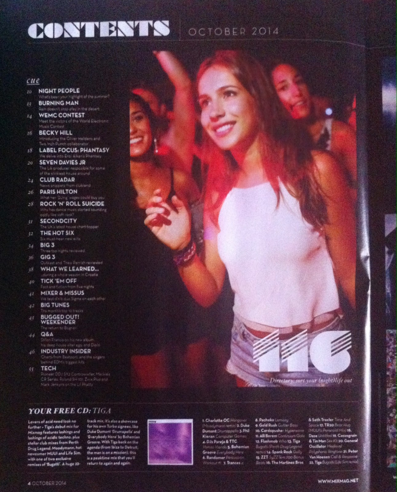
-1 image on first contents page. Bright image contrasts from black background. Additionally the image has a large page number on it, in comparison to the other page numbers, making it more eye-catching and the reader would want to read it.
-Image shows a girl at a music event, giving us an insight about the article on page 116, suggesting night life.
-The different fonts make the contents page look artistic and minimalistic but also modern and futuristic,
-Contents title is "cue".The sections in the contents page are in columns and are aligned, making the contents page organised allowing the articles in the magazine to be seen, making it easy to find the chosen article. Examples of what is under the "cue" section is a Q&A and a article about Paris Hilton and her DJ wages.
-The images do not have frames, giving the page a modern feel.
-The bottom of the page shows us the free CD that is provided with the magazine. By having a free CD with the magazine may draw the customer to buy the magazine as well, if they are interested in the genre of music or interested in the artist. This reflects to the front cover as Tiga is the featured cover star.
-Has the website at the bottom right corner and includes page numbers so when readers are trying to find a particular article, they can find it with ease.
 Contents Page 2 Analysis:
-The  3 colour scheme for the contents page is white, black and grey.
-The different fonts make the contents page look artistic and minimalistic but also modern and futuristic,
-The images do not have frames, giving the page a modern feel.
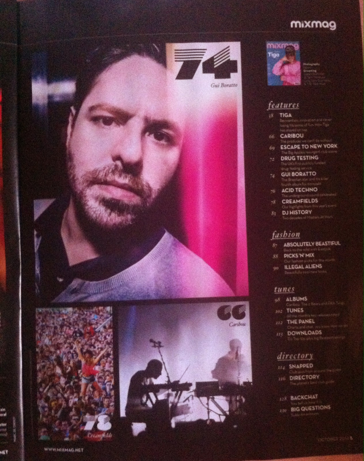
-3 images on second contents page.Bright images contrasts from black background. Additionally the images have  large page numbers on them, in comparison to the other page numbers, making them more eye-catching and the reader would want to read them.  Page 74 shows us an article about Gui Baratto, showing us a close-up image of his face on the contents page. The image of Baratto is bright and shows pink, white and black. The white and pink contrast from the background making the image stand out. By the image of Gui Baratto being larger compared to the other two images on the second contents page (page 78 about Creamfields and page 66 about Caribou) makes the image stand out the most, so readers would want to read on page 74.
-Furthermore,the images are all in the same area, making the page more organised and separates the information on the page, allowing the reader to identify the articles and pages from one another.
-The images of Gui Baratto and Caribou reflect to the front cover as Gui Baratto is under the "Plus" cover line and Caribou have their own cover line "Can't Do Without You".
-There are more sections in the second contexts page such as "features","fashion", "tunes" and "directory". By having the sections separate allows the readers to find articles with different subjects with ease. If the reader wants to look up fashion ,they are able to look at the fashion section and choose one of the fashion pages.By having the section "cues" on the first contents page and the other sections on the second contents page, makes the "cue" section seem more important compared to the other sections.
-Has the website at the bottom right corner and includes page numbers so when readers are trying to find a particular article, they can find it with ease.  It also has the name of the magazine at the top right corner, branding the magazine.
 Double Page Spread Analysis:
-The 3 colour scheme of the double page spread is pink, black and white, The colour pink seems to be the colour for the front cover and double page spread article of Tiga, showing us that the colour pink relates to Tiga.
- On the right upper corner of the page has Tiga's name on it, showing us that the article is about Tiga.
-There are two columns in this page of the featured article however this structure is not consistent, as the other pages featuring Tiga have three columns or just 1 column. Fortunately, even though the number of columns is not the  same throughout, the columns are aligned, making the page organised and simple to read.
-The font size remains the same throughout the columns however in some of the smaller text boxes on other pages, the font becomes smaller and has bold text. This is probably to allow more text into the section and the bold text is to make the text stand out and visible. The drop cap on the third paragraph, on the second column is similar to the design on the top left corner of the page. The drop cap looks futuristic and artistic, corresponding to the genre of music he creates, which is futuristic and artistic. This is known because I  had previously listened to his music, so I know the type of music he makes.
-There is only one image on the double page spread. The image makes the article interesting ,as some readers prefer images instead of a whole page dedicated to text. The image makes the article more appealing as a result. The image also shows Tiga performing at the Bob Beaman club in Munich, making him look like a professional DJ. As for his attire, he is wearing his signature snap-back/ hat. The bright image contrasts from black background, bringing colour to the page.
-The white pull quote on the image highlights a quote from Tiga and makes it similar to other magazines which include captions and quotes from artists. Additionally, it gives us a insight to Tiga, giving us the image of him being a artist who creates unique music and enjoys seeing people love his music.
-The article is about a DJ called Tiga. The journalism in the article is refreshing and unusual ,as  it starts as a biography of how Tiga became a DJ then becomes a sort of interview without the questions, just quotes or responses. Throughout the text, the tone of voice in the biography and interview is conversational, as the language used is not complex and informal (e.g. "Girl comes up to me and says 'What you driving'. I say,  Bugatti"). Some of the language used by Tiga seems to be slang. This shows us that the target audience for the magazine is for teenagers but also young adults who are interested in club life or  club music.

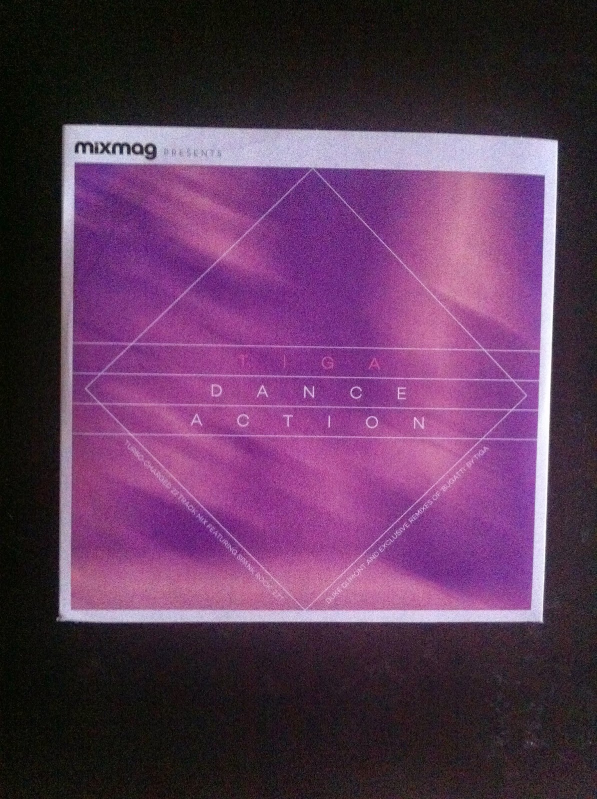
This product (CD) came along with the magazine for free. By having a free CD attached to the magazine appeals to customers as some may be interested in dance music or they are interested in Tiga as a artist and enjoy the music he makes. This will make more people want to buy the magazine and will increase the sales. Additionally, by having the CD on the magazine, it will help to promote Tiga more, creating an increase in fans and make his music more popular, allowing him to make money,

Mixmag is published by Development Hell Ltd, along with the Mixmag Ipad app, mixmag.net, Mixmag TV, Mixmag Events and dontstayin.com. Mixmag also has a facebook , Twitter, Google+ and Soundcloud page.  On their website, they also have a shop where customers/ readers are able to buy products such as mixmag albums, such as the Tiga album and T-shirts. The board of Development Hell is chaired by Peter Strong and comprises Managing Director Jerry Perkins, Editorial Director David Hepworth and Finance Director David Joseph.


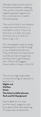
From looking at the Mixmag media pack, the percentage of female readers are 28% and the percentage of male readers is 74%, showing us that there are more male readers . Additionally the media pack tells us that the median age of a Mixmag reader is 24. The majority live in cities and are single, showing us that the audience is young as they are single. 

From looking at the reader/audience profile, we learn that the mixmag readers are people who are generally into club life and tend to be content creators. Additionally they are interested in new fashion and trends.Readers of the magazine tend to be young DJs and those who are interested in DJing and upcoming tunes.  The readers tend to have much time for nights out, clothes, music, the latest mobile phones and technology and DJ equipment. Nearly 80% do not read another music magazine and they spend little time watching TV, especially at weekends. From this description of the reader/audience, we can see that the magazine is read by a young audience, who has a lot of time, living in prosperity and following a career path in music.
Source: Mixmag Media Pack.

Audience percentages: 
32.9% in United Kingdom 
21.3% in United States
4.39% in France
3.49% in Germany
3.48% in Canada
2.98% in Australia
2.64% in Brazil
2.30% in Netherlands
1.89% in Spain
1.57% in Italy
22.69% in Others

Traffic:                                                 
Over 1 billion impressions per month.            
Over 450,000 unique users per month.

Social Media:
680,000 on Google+
300,000 on Facebook
380,000 on Soundcloud
135,000 on Twitter


From looking at the Audience profile , we learn that the percentage of the female audience is 41%, whilst the male audience is 59%, showing us that there are more male readers of Mixmag. With both the male and female audience, the age at which most people read Mixmag is 18 to 24 at 21% for females and 28% for males, whilst the age at which people do not read Mixmag as much is 55 to 64 at 0.2% for females and 0.3% for males. From this chart, we can see that Mixmag is targeted to a younger audience as the percentage from 13 to 34 is higher in comparison to 35 to 65+.  However the percentage of 35 to 44 year old males who read Mixmag is higher in comparison to 13 to 17  as 35 to 44 is 6% whilst 13 to 17 is 4%, showing us that the magazine is mostly read by men who are from 18 to 44, showing us that the magazine can be read by teenagers, young adults and adults. As for the female audience , the magazine aims for women  between the age range of 18 to 34, as they have a higher percentage compared to the other age ranges.


Wednesday, 24 September 2014

Analysis of Q magazine and Group Feedback/Report on magazine analysis

In class today, we analysed our given magazines, in this case Q magazine. After analyzing the features of the magazine, as a class we reported the analysis we had made to the class, and made a list of the feature of a contents page and features of a DPS (Double Page Spread). By analyzing the magazines, we are able to identify the features of the music magazines we need to buy for Task 2 of our coursework. Here is a image of the list we made in class:

Tuesday, 23 September 2014

VIBE Magazine Front Cover, Contents Page and Double page spread analysis

 In today's class, we analysis the magazine VIBE. By analyzing the magazine, we learnt about some features in the magazine that we did not know about such as masthead and sky lines. Additionally we analyzed the cover star's attire and body language as well as the editorial features of the magazine, such as the color scheme and the theme of the cover star's attire (in this case, a pilot). From the images below, here is a detailed analysis of the magazine cover:


Monday, 22 September 2014

AS Media: Contents Page and Double Spread Page Analysis

Contents Page Analysis Page 1:
-2 pages for content page
-The color scheme of the magazine is red , black and white(e.g. red t-shirt on featured artist, featured articles underlined with red.
-Contents page reflects the front cover by which the contents page and front cover shows a full body image of artist who is featured in the main article, in this case, Billy Clyro.
-Editorial features: The sections  in the contents page are in columns and are aligned, making the contents page organised allowing the articles in the magazine to be seen, making it easy to find the chosen article.
-Images are scattered around the page,showing the different artists featured in the magazine. By being scattered around allows the whole page to be covered instead of having a blank page, catching the readers attention. The images do not have frames, giving the page a modern theme despite the font.Additionally the images have numbers placed on them, so the reader is able to find the article. By the number 72 being larger than the other numbers highlights the featured article about Billy Clyro, so more readers will go to the featured article as the 72 is bold so it stands out, compared to the other page numbers which are smaller.
-Posing cover star: casual attire
-Positioning of cover star:holding the guitar suggest manliness, like holding an axe or weapon. He is not stareing  the camera- could suggest  that he is disinterested or thinks he's too cool.
-
Contents Page Analysis Page 2:
-The first page has features whilst the second page has regulars, separating the important/ popular articles from the unimportant/unpopular articles. 
-The color scheme is still a running theme throughout the contents page.
-The images do not have frames, giving the page a modern theme despite the font.Additionally the images have numbers placed on them, so the reader is able to find the article. Furthermore, the images are all in the same area however they are not aligned. This makes the page organised and separates the information on the page, allowing the reader to identify the articles and images from one another.The majority of the images are dark and lack vividness. This juxtaposes from the white background, making the images stand out and catch the audiences' eye.
-Texts in red catches audiences' eye so more people will read it.

Double Page Spread Analysis:
-The Big T behind the text juxtaposes from the white background making it eye-catching and follows the theme of red in the magazine. The big T also stands for the starting sentence of the article making it an interesting and different type of double page spread. 
-The piece of text is about a band called The FOO Fighters. The journalism in the article has a interesting structure as it starts as a normal article then becomes a interview. The tone of voice in the interview is conversational as there is the inclusion of explicit language.However in the article, the language is formal and professional, showing us that the target audience for the magazine is for adults who have a passion for music.
-The images make the article interesting ,as some readers prefer images instead of a whole page dedicated to text. The images make the article more appealing as a result. The image also shows Foo Fighters in action, making them look like true musicians. 
-The red pull quote on the images highlights some of the words from the band and makes it similar to other magazines which include captions and quotes from artists. The quote itself makes Dave Grohl look manly as he doesn't like getting emotional but also a man of peace.
-The color scheme is still a running theme throughout the magazine.
-All of the Foo Fighters are wearing casual attire, fitting the stereotype of rock artists.

Front cover analysis:
-Four colour scheme: gold, black , red and white
--Posing cover star: casual attire
-Posing cover star: casual attire
-Positioning of cover star:holding the guitar suggest manliness, like holding an axe or weapon. He is not stareing  the camera- could suggest  that he is disinterested or thinks he's too cool.
-Special cover for subscribers, lack other cover lines.
-Long shot
Image in the corner of contents page:
-different in comparison to main cover of Q magazine as this magazine cover in the corner is for subscribed members of the magazine, who recieve the magazine. 
-The subscription magazine is different as it has the names of other artists mentioned on the cover, showing that if people who truly enjoy the magazine want to read the content in Q magazine.

Sunday, 21 September 2014

AS Media Evaluation by Cengizhan Sen

In Media, we were instructed to develop our journalism by writing an article about the changing face of the music industry, music piracy and file-sharing. Additionally, we used our recent knowledge of In Design to create a template for our article, giving the image of a magazine article. In this evaluation, I will be discussing the various factors of the process in creating my magazine article with my journalism and In Design. 

The process of writing an article involved obtaining information about music piracy and file-sharing, such as facts, statistics and quotes from various artists. Some of the strengths of my research were that most of the sites used were reliable, such as Time.Com and News.com.au, as they were news sites and had various articles dealing with serious issues. However the article from News.com.au was much older, so the information delivered could have been out-of-date, whereas the article from Time.com was published in 2014. Furthermore, the information from the News.com.au was from Australia and the statistics were based on an Australian audience.  Complementary to News.com.au, I attained information from the official RIAA site, which also contained information focusing on the American music industry and music economy. I obtained information from BBC, involving information on the BPI (The British Recorded Music Industry) which was reliable as it focused on the British music industry and was published in 2013, making the information in the article current and reliable. I also used information from cracked.com, however due to the humorous take on the subject of music piracy in the cracked.com article about Napster P2P and the up rise of file-sharing; I decided to confirm the information with Wikipedia. However since information on Wikipedia can be edited, there is a chance that the information was erroneous. The last website I used was Apple Insider. Apple Insider consisted of mostly about Apple products, showing knowledge in ITunes and various other Apple products. However the article about music piracy and file-sharing was published in 2010, so the information given in the article may have been unreliable and out-of-date.

In my journalism, my target audience was aimed at a mature, cultured audience, who have an interest in technology and sub-culture, as well as having a sense of humor. My publication was aimed at being a global publication, due to the foreign statistics and facts. The strengths of my journalism were the use of language. The majority of the language in my article was formal and consisted of phrases that a younger audience might not understand (e.g. the stumbling blocks of music piracy and file-sharing).I used formal language as a way of showing that the article was aimed at educated people and I used informal language as a way creating a conversational tone of voice however this might have given an unprofessional image to the article, resulting in not being aimed at my chosen target audience. I also added persuasive techniques such as rhetorical questions, to make the audience have a verdict (e.g. who wants to listen to mediocre, shabby music? No one).I also used humorous language as a way of making the article interesting and entertaining to the reader (e.g. “As Jessie J says in her song “Price Tag”- “It ain’t about the money, money, money; we don’t need your money, money, money. We just want to make the world dance, forget about the price tag!”). However, similar to the informal language as a way of creating a conversational tone of voice, the humorous language may seem improper for such a serious subject, depending on the reader. In my conclusion, where I presented my opinion, I used emotive language as a way of expressing my opinion towards music piracy and file-sharing (e.g. People slave at bringing money into that cashier, just how artists slave to make good music and make a living). By using emotive language creates a sense of injustice in the music industry and shows how strongly I feel about this injustice in the music industry.

To create a magazine article, we used In Design as a way of creating a template for our article and designing it to look similar to an actual magazine article. The strengths of my use of In Design were that I learnt various ways to make a magazine article. I learned how to make columns and text boxes by using various tools on In Design. Likewise, I learnt how to place pictures, headers, captions, drop caps, colour to text etc.  In spite of the strengths of In Design, I faced much difficulty with making my article look analogous to an actual magazine article. Furthermore, I found it strenuous to organize my article and moving the columns to make my article look professional and a fusion between a broadsheet and a technology magazine article.In the beginning, since I had only an insight to In
Design, it was slightly challenging however after learning about the tools and how to use In Design, was finally able to start my magazine article design.

To keep a record of the progress and work we make, we made our own personal AS Media blogs, as evidence of our work . Starting my blog was simple and effortless, as I had previously blogged with Blogger myself.  The strengths of web publishing is that compared to printing, it is cost efficient as no paper is wasted and there is no distribution.  Additionally customers do not need to spend money to the article online, in comparison to printing the article which can be expensive and customers may not consider wanting to buy something overpriced. Furthermore, web publishing allows people from other countries to read the article which may not be available in their country via the Internet.
The audience feedback was valuable and constructive by which it helped to reflect on my work and for me to have a future reference for another magazine article. One of the comments I received was from Owen Hickley, who commented on my work:

“The writing is informative and intelligent, not appealing to anyone group but easy to read never the less. The highlighting of the quotations is a good idea as it draws the eye however the lack of a background makes it look slightly garish. The removal of the boxes around the text would also assist in a more professional presentation of the article. The inclusion of the pictures is a nice touch but the selection of pictures could be better as the text on one of the pictures looks unprofessional. There are a lot of included facts and figures that inform the reader and give them insight into the subject, the inclusion of American facts could be seen as unneeded in a British publication but seeing as I do not know what publication it is being published in it may also be useful.


From looking at the audience feedback, I am able to set myself targets for improvement. Firstly,  I should show that my article is aimed at my audience through my journalism, so my target audience is clear and I am able to grab their attention, so I will be able to appeal to my audience. Additionally I should pick out my facts and statistics according to the date and location, as some information can be out-of-date due to date and different due to location. As for the appearance, I should make my article more eye-catching by adding a background. Lastly, the images I use should be professional compared to the images I used for my article as it can look unprofessional.

Saturday, 20 September 2014

Timetoast:Production Schedule

In class, we created our first ever production schedules as a way of organizing the production of our magazine covers. We did this by using Time Toast, a site which allows us to create timelines as a way of organizing.

Tuesday, 16 September 2014

Induction journalism


This the final product of my Induction journalism that consisted on the use of InDesign as a way of creating a magazine article about the impact of music piracy and file-sharing on the music industry. Please comment, I'd appreciate the feedback! Thank you!

-C.

Monday, 15 September 2014

Getting started on my journalism and InDesign!

So,I have recently begun creating the template for my InDesign magazine article and have started to copy my journalism to the InDesign. My magazine is focused on people who are passionate about technology and are also educated-this is going to be shown in my journalism and the design of the article! Anyway, please keep on reading my updates on my projects! Bye!

-C.

Saturday, 13 September 2014

First blog: introduction to blog!

Hey and welcome to my blog! On my blog I will be posting my activities and work in ASMedia and the development of my projects! Keep in track of my upcoming blog entries and I hope you enjoy it! Thanks!

Bye!

-C