Front Cover Analysis:
-The Masthead is bold and bright, standing out from the blue background. The font also has a modern look and is composed of the words mix and mag (short for magazine), showing us that it is a music magazine. By the word magazine being shortened to mag makes it similar to slang and shows us the target audience as being young.
-House style
-3 colour scheme consisting of pink, white and blue, giving it a colourful look which is eye-catching and appealing.
-Cover star Tiga: Attire is bright and is the same as pink font. Contrasts from background. Wearing a snap-back with the words "ACTION" on it, showing us that he is trying to promote his new album"Action Dancing".
-Cover star positioning: One hand near his ear as if he's calling someone other hand crossed, making him look confident or as if he's calling someone.Upper body shot, studio photo shoot.
-Cover star face: no emotion but looking directly at camera. This makes him look serious. By looking at the camera and acting as he's talking to someone is as if he is talking to the reader. Additionally lighting casts a shadow on his eyes making him look even more serious and full of attitude.
-Cover lines: "Plus" cover line shows us the other artists featured the magazine but by Tiga's name being the biggest shows us that he is the featured main artist. By his name being bigger in comparison to the other cover lines makes it more eye-catching, so readers interested in Tiga will buy it, showing us that the featured article is about Tiga. Additionally the cover lines also show the other articles inside the article (e.g. Caribou "Can't Do Without You")
Skyline: "The world's biggest dance music & club culture magazine". Shows us the genre of music that is in the magazine. By using the word "world" could suggest that it is a global magazine or could be an exaggeration.
Quote: "I was the guy who wore a gas mask to parties". Could suggest that he was a anonymous artist.
-Bar code in the bottom right corner.Next to bar code is the website for mixmag, promoting website. Also shows price of magazine.
.jpg)
Contents Page 1 Analysis:
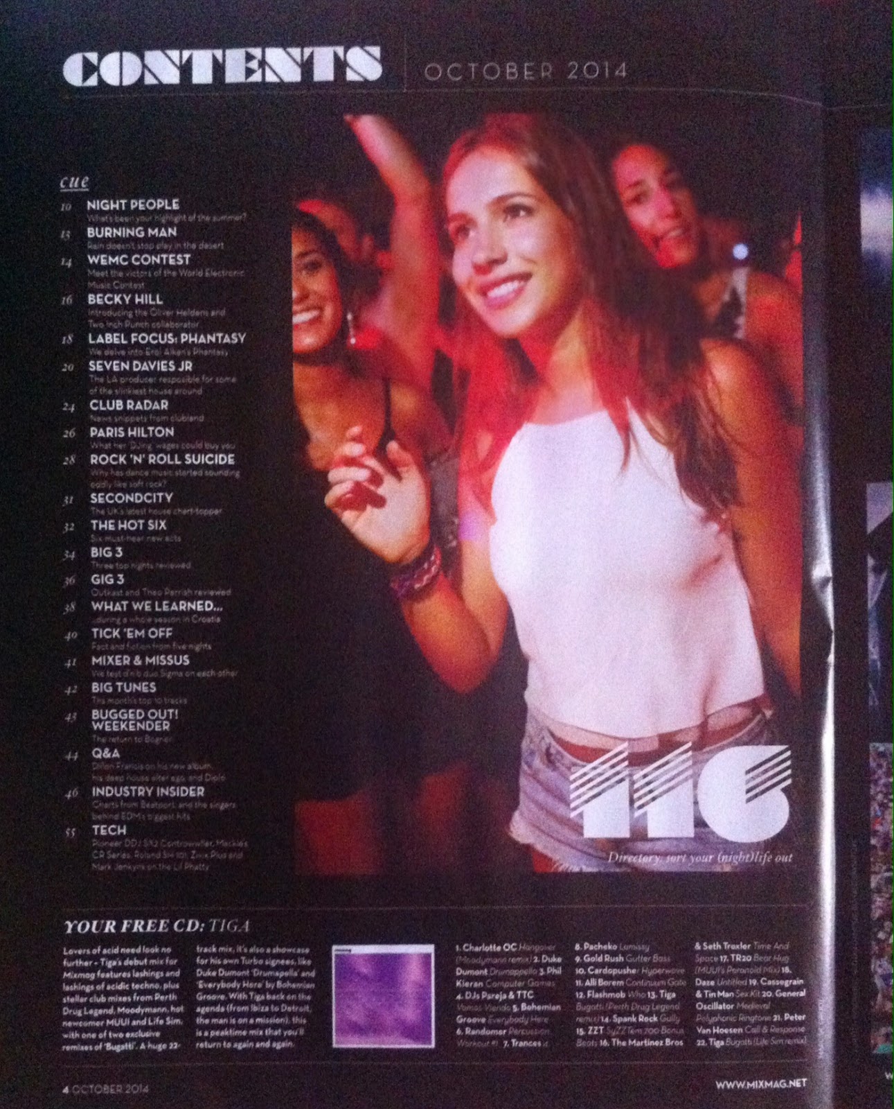
-2 pages for contents page.
-The 3 colour scheme for the contents page is white, black and grey.
-1 image on first contents page. Bright image contrasts from black background. Additionally the image has a large page number on it, in comparison to the other page numbers, making it more eye-catching and the reader would want to read it.
-Image shows a girl at a music event, giving us an insight about the article on page 116, suggesting night life.
-The different fonts make the contents page look artistic and minimalistic but also modern and futuristic,
-Contents title is "cue".The sections in the contents page are in columns and are aligned, making the contents page organised allowing the articles in the magazine to be seen, making it easy to find the chosen article. Examples of what is under the "cue" section is a Q&A and a article about Paris Hilton and her DJ wages.
-The images do not have frames, giving the page a modern feel.
-The bottom of the page shows us the free CD that is provided with the magazine. By having a free CD with the magazine may draw the customer to buy the magazine as well, if they are interested in the genre of music or interested in the artist. This reflects to the front cover as Tiga is the featured cover star.
-The bottom of the page shows us the free CD that is provided with the magazine. By having a free CD with the magazine may draw the customer to buy the magazine as well, if they are interested in the genre of music or interested in the artist. This reflects to the front cover as Tiga is the featured cover star.
-Has the website at the bottom right corner and includes page numbers so when readers are trying to find a particular article, they can find it with ease.
.jpg)
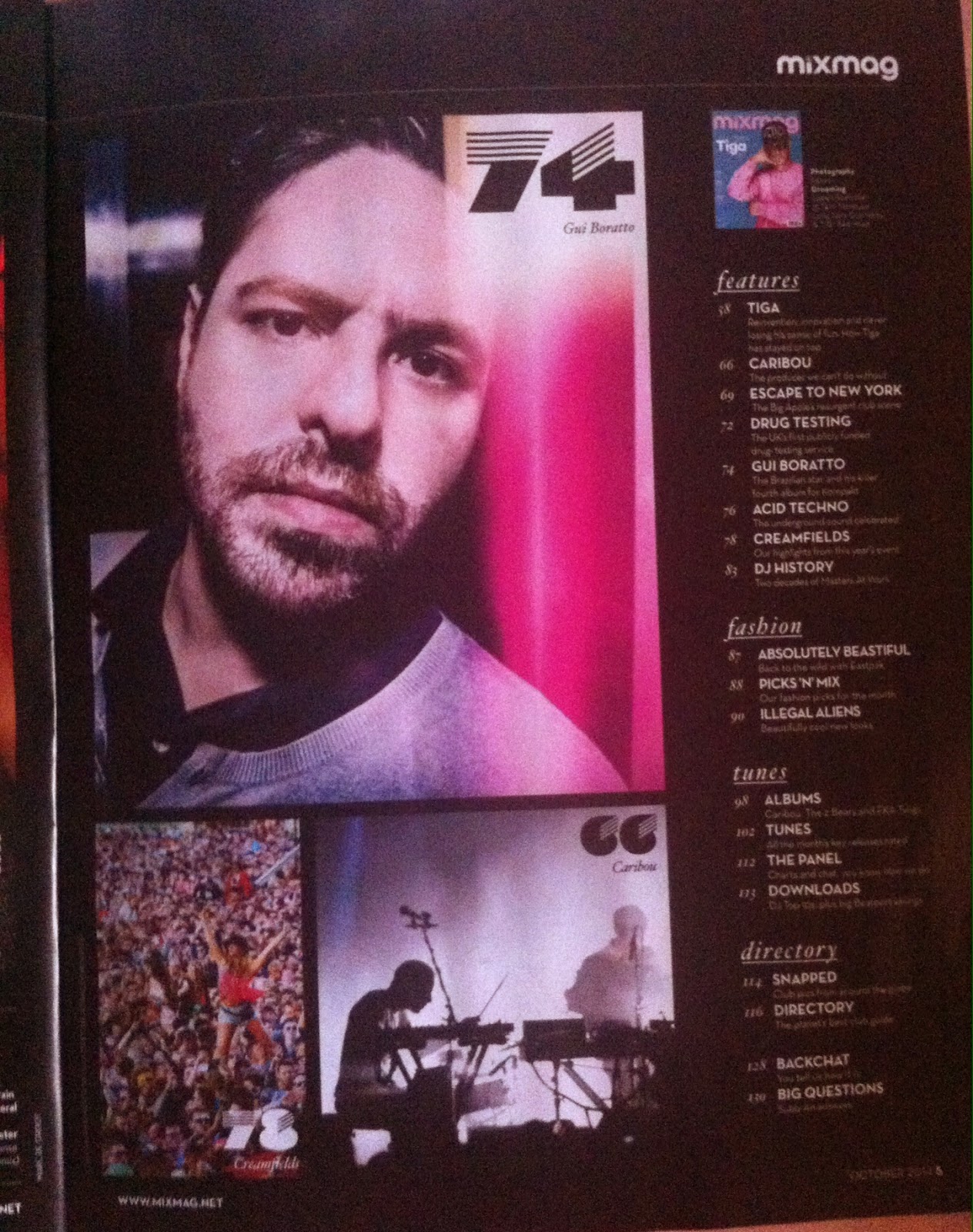
-The 3 colour scheme for the contents page is white, black and grey.
-The different fonts make the contents page look artistic and minimalistic but also modern and futuristic,
-The images do not have frames, giving the page a modern feel.
-3 images on second contents page.Bright images contrasts from black background. Additionally the images have large page numbers on them, in comparison to the other page numbers, making them more eye-catching and the reader would want to read them. Page 74 shows us an article about Gui Baratto, showing us a close-up image of his face on the contents page. The image of Baratto is bright and shows pink, white and black. The white and pink contrast from the background making the image stand out. By the image of Gui Baratto being larger compared to the other two images on the second contents page (page 78 about Creamfields and page 66 about Caribou) makes the image stand out the most, so readers would want to read on page 74.
-Furthermore,the images are all in the same area, making the page more organised and separates the information on the page, allowing the reader to identify the articles and pages from one another.
-The images of Gui Baratto and Caribou reflect to the front cover as Gui Baratto is under the "Plus" cover line and Caribou have their own cover line "Can't Do Without You".
-There are more sections in the second contexts page such as "features","fashion", "tunes" and "directory". By having the sections separate allows the readers to find articles with different subjects with ease. If the reader wants to look up fashion ,they are able to look at the fashion section and choose one of the fashion pages.By having the section "cues" on the first contents page and the other sections on the second contents page, makes the "cue" section seem more important compared to the other sections.
-Has the website at the bottom right corner and includes page numbers so when readers are trying to find a particular article, they can find it with ease. It also has the name of the magazine at the top right corner, branding the magazine.
Double Page Spread Analysis:
-The 3 colour scheme of the double page spread is pink, black and white, The colour pink seems to be the colour for the front cover and double page spread article of Tiga, showing us that the colour pink relates to Tiga.
- On the right upper corner of the page has Tiga's name on it, showing us that the article is about Tiga.
-There are two columns in this page of the featured article however this structure is not consistent, as the other pages featuring Tiga have three columns or just 1 column. Fortunately, even though the number of columns is not the same throughout, the columns are aligned, making the page organised and simple to read.
-The font size remains the same throughout the columns however in some of the smaller text boxes on other pages, the font becomes smaller and has bold text. This is probably to allow more text into the section and the bold text is to make the text stand out and visible. The drop cap on the third paragraph, on the second column is similar to the design on the top left corner of the page. The drop cap looks futuristic and artistic, corresponding to the genre of music he creates, which is futuristic and artistic. This is known because I had previously listened to his music, so I know the type of music he makes.
-There is only one image on the double page spread. The image makes the article interesting ,as some readers prefer images instead of a whole page dedicated to text. The image makes the article more appealing as a result. The image also shows Tiga performing at the Bob Beaman club in Munich, making him look like a professional DJ. As for his attire, he is wearing his signature snap-back/ hat. The bright image contrasts from black background, bringing colour to the page.
-The white pull quote on the image highlights a quote from Tiga and makes it similar to other magazines which include captions and quotes from artists. Additionally, it gives us a insight to Tiga, giving us the image of him being a artist who creates unique music and enjoys seeing people love his music.
-The article is about a DJ called Tiga. The journalism in the article is refreshing and unusual ,as it starts as a biography of how Tiga became a DJ then becomes a sort of interview without the questions, just quotes or responses. Throughout the text, the tone of voice in the biography and interview is conversational, as the language used is not complex and informal (e.g. "Girl comes up to me and says 'What you driving'. I say, Bugatti"). Some of the language used by Tiga seems to be slang. This shows us that the target audience for the magazine is for teenagers but also young adults who are interested in club life or club music.
.jpg)
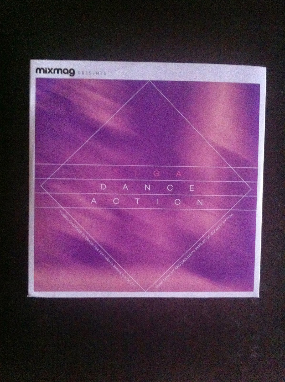
This product (CD) came along with the magazine for free. By having a free CD attached to the magazine appeals to customers as some may be interested in dance music or they are interested in Tiga as a artist and enjoy the music he makes. This will make more people want to buy the magazine and will increase the sales. Additionally, by having the CD on the magazine, it will help to promote Tiga more, creating an increase in fans and make his music more popular, allowing him to make money,
Mixmag is published by Development Hell Ltd, along with the Mixmag Ipad app, mixmag.net, Mixmag TV, Mixmag Events and dontstayin.com. Mixmag also has a facebook , Twitter, Google+ and Soundcloud page. On their website, they also have a shop where customers/ readers are able to buy products such as mixmag albums, such as the Tiga album and T-shirts. The board of Development Hell is chaired by Peter Strong and comprises Managing Director Jerry Perkins, Editorial Director David Hepworth and Finance Director David Joseph.
From looking at the Mixmag media pack, the percentage of female readers are 28% and the percentage of male readers is 74%, showing us that there are more male readers . Additionally the media pack tells us that the median age of a Mixmag reader is 24. The majority live in cities and are single, showing us that the audience is young as they are single.
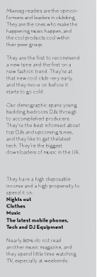
From looking at the reader/audience profile, we learn that the mixmag readers are people who are generally into club life and tend to be content creators. Additionally they are interested in new fashion and trends.Readers of the magazine tend to be young DJs and those who are interested in DJing and upcoming tunes. The readers tend to have much time for nights out, clothes, music, the latest mobile phones and technology and DJ equipment. Nearly 80% do not read another music magazine and they spend little time watching TV, especially at weekends. From this description of the reader/audience, we can see that the magazine is read by a young audience, who has a lot of time, living in prosperity and following a career path in music.
Source: Mixmag Media Pack.
Audience percentages:
32.9% in United Kingdom
21.3% in United States4.39% in France
3.49% in Germany
3.48% in Canada
2.98% in Australia
2.64% in Brazil
2.30% in Netherlands
1.89% in Spain
1.57% in Italy
22.69% in Others
Traffic:
Over 1 billion impressions per month.
Over 450,000 unique users per month.
Social Media:
680,000 on Google+
300,000 on Facebook
380,000 on Soundcloud
135,000 on Twitter
From looking at the Audience profile , we learn that the percentage of the female audience is 41%, whilst the male audience is 59%, showing us that there are more male readers of Mixmag. With both the male and female audience, the age at which most people read Mixmag is 18 to 24 at 21% for females and 28% for males, whilst the age at which people do not read Mixmag as much is 55 to 64 at 0.2% for females and 0.3% for males. From this chart, we can see that Mixmag is targeted to a younger audience as the percentage from 13 to 34 is higher in comparison to 35 to 65+. However the percentage of 35 to 44 year old males who read Mixmag is higher in comparison to 13 to 17 as 35 to 44 is 6% whilst 13 to 17 is 4%, showing us that the magazine is mostly read by men who are from 18 to 44, showing us that the magazine can be read by teenagers, young adults and adults. As for the female audience , the magazine aims for women between the age range of 18 to 34, as they have a higher percentage compared to the other age ranges.
.jpg)
.jpg)


Another excellent case study, tiny bit less detail but still very strong. Perhaps linking more to genre with images and colours chosen, also connecting your press kit info such as more male audience to the cover start being male would be good. Excellent detail in terms of images and text, language and style.
ReplyDeleteExcellent work,
Amy