Thursday, 27 November 2014

(Late update) Music Magazine Proposal Video(s)

PART 1
PART 2
I apologize for the delay of the videos for my music magazine proposal. The delay was caused because my video was over 15 minutes. Due to YouTube regulations, my video had to be cut into two parts, as you can only upload videos that are 15 minutes long, if you have a G mail account which has been activate for a year. As my account has not been active for a year, I had to cut the video. Additionally, I have made some modifications to my presentation and my magazine. In the proposal, I am presenting the genre of Japanese electropop. However after the various photo shoots and seeing that my photos did not look Japanese or hold any relevance to Japanese music, my teacher Amy had suggested that I should simply focus on electropop, as Japanese electropop would be far too specific and may not be as appealing as standard electropop. This lead me to making slight changes in my presentation such as:

-The inspiration magazines used for colour scheme. Previously Japanese magazines, now I-D magazines.
- The artists included in the magazine (the contents of the magazine).
-The videos used to show electropop and its popularity.
-The draft cover of the magazine.

I also removed the words associated with Japanese electropop, Jpop and Japan, as a way of completely showing a change in the genre. 

Audience Feedback:
After my presentation, I did not receive a large proportion of feedback. I received positive comments which showed that the plan for my magazine was in-depth. One of the students commented saying:

"He has everything planned, like he knows exactly what he was doing. He's covered literally everything. He's got a good idea of what he's doing." -Selina

Another student has commented saying:

"I like how he's demonstrated what type of music his magazine is involved in, with the link. I've never heard of different Japanese music. It is very cute and nice."

Vanessa, my teacher also commented saying:

"I like the way you thought about content creators and people making their own versions on YouTube and that's an audience you were targeting because it allows for more interaction because you were thinking of creating an app which the audience can create their own versions of things. Brilliant pitch. Well done!"The only thing that wasn't clear was the design features. You have thought about colours but not the font. But that's not going to be a problem because this week, we will be looking much more closely at fonts".

When the class was asked if they would purchase my magazine, there was no response. This could be interpreted as a decline in purchase. This is probably due to not being interested in Japanese music or finding it weird or irritating, which many people who don't know about Japanese music think when they listen to it. However, despite the class rejecting my magazine due to its uniqueness, I still believe that if I had continued with the same concept and genre, my magazine would have a stable readership and stable sales. This is because Japanese music and Japan as a whole has become immensely popular and there are many people around the world who love Japan, including myself.


Monday, 24 November 2014

Music Magazine Preparation

In today's lesson, I have started using InDesign as a way of creating my contents page for my music magazine (Bounce). I have started to follow the layout of my plan and have added certain features such as the columns, masthead of contents page and various other features (e.g. content lines, page numbers, images of artists, social media logos and sections dedicated to different parts of the magazine). These features are necessary in creating a realistic and professional magazine, as many magazines around the world have these features. I will continue to post the development process of my magazine.

Tuesday, 18 November 2014

Flat Plan Analysis of Mixmag Magazine

Q1)How does a flat plan link to the contents page?
A flat plan links to the contents page by which it outlines and highlights what's in the magazine, just in a different, unique format. In contents pages, the contents in listed and put in sections whilst on a flat plan, it is laid out in a structure of boxes, a table.

Q2)How many different categories or types of content are there?
In Mixmag, all the types of content have been sectioned in the contents page. On the first page of the contents page, there is a section called cue. In cue, articles are presented-in a queue!. Cue is in chronological order and is the first section presented throughout the magazine. On the second page, there are 4 sections- features, fashion, tunes and directory. These are presented on the second page as there is less articles about them. The 'features' content is dedicated to great artists  and places. Features also includes the DPS article for the cover star. The 'fashion' content comprises of fashion in dance music. As for tunes, it comprises of albums, monthly key releases, charts and chats and downloads. Lastly, directory comprises of Club Pics, Club guides, Readers opinions and big questions.

Q3) Percentage of advert/editorial?
More editorial, less advert. 60% editorial and 40% advert.


Q4?How does the "look", typography,layout, style, colour scheme reflect the musical genre?
From looking at the magazine, the colour scheme involves monochrome colours, alongside bright, vivid, bold colours, giving the magazine the look of a night club, showing us that the musical genre involves club/dance music. As for the typography, there is a variation in fonts. Some of the fonts are simple and minimalistic, giving an artistic feel to the magazine, whilst there are also fonts which are interesting and futuristic. As dance music has been branded as futuristic and the fonts are unique and futuristic, this shows us that the musical genre is dance music. As for the layout, it is organised by which some text is in boxes, lines and columns. However, text has been placed in different areas of the page, taking up more space on the page and letting the reader scan the page. This is similar to dance music as it is a mash-up of sounds and like dance music, the text has also been "mashed" onto the page and has spread out!

Q5)How does the task help you understand how to plan the contents page of your own magazine?
The task has helped me understand how to construct my own contents page for my magazine, by which  it has helped me to know what types of things I will include in my contents page, such as interviews with artists, introducing artists, news on the latest venues and festivals, "Night People", popular songs, charting and various other content!

Q6)More text or images?
From looking at the proportionality between editorial and ad, despite there being more editorial content, the magazine includes more image than text. The text has been made small so it looks like there is more text. There is an image on most of the pages. The images are more appealing in comparison to a whole page dedicated to text, showing us that the audience is a visual audience.

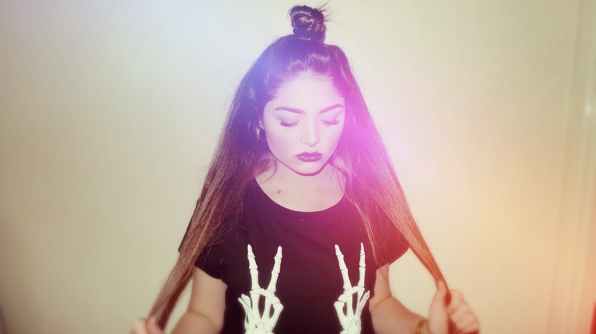
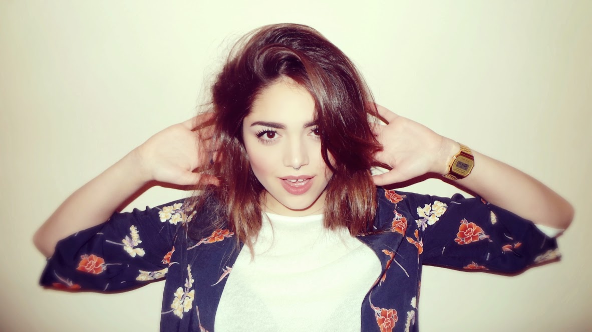
Photography for Music Magazine

In my photography, I used different styles and looks to show different sides to the artist. I also used filters and effects, as a way of enhancing the images and making them look high-quality and professional. Despite taking all these photos, I will only use a few images in the magazine.